Redesigning my Personal Landing Page
Background
“Jo Ionescu’s Portfolio” is my personal portfolio website. This is my way of presenting my work and skills and, what is also very important, who am I as a designer, and what I see, think, and feel. This is my opportunity to show to the recruiters or companies, who am I when I create when I collaborate, when I am looking for solutions, and solve problems.
A portfolio’s landing page should be the one that already creates an impression of what it is all about, and who the designer is as a professional and a human being.
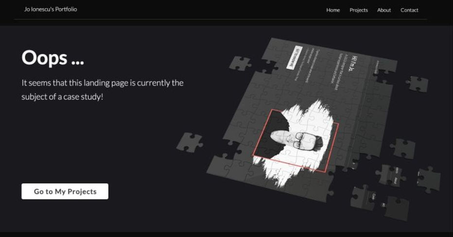
This was the existing landing page:

Analysis
Before starting my research, I have asked myself a few questions:
-
What is the purpose of my landing page?
-
Who is it for?
-
What do I have to offer?
-
Why would visitors want to take action on the page?
-
What action do I want the visitor to take?
Those questions helped me further in my research process: my landing page will mainly be accessed by recruiters, companies that are hiring, and anyone else who would benefit from my services.
What services?
My offer is everything related to user experience design from concept to delivery, and I am responsible for competition research, conducting interviews, paper and digital wireframing, low and high-fidelity prototyping, conducting usability studies, accounting for accessibility, and iterating on designs.
In addition to heuristic analysis, in order to understand the audience better, I ran an online Google Forms. As the purpose of my landing page is to promote myself and my skills in landing my dream job, with Google Forms I targeted recruiters, talent acquisition, and hiring companies.
The information that was helpful in designing a valuable personal landing page were:

After analyzing 23 answers from the survey, the top themes found based on the results of the online survey were:
-
20 responders found that the message of the headline is very important while 3 answered that it is somehow important.
-
23 responders answered that the users of the landing page are scanning the content
-
7 responders answered that the secondary path to act is not very important, 5 checked neutral/I don’t know while 11 replied that it is somehow important
-
9 responders considered that is somehow important to see projects briefly shown on the landing page, 8 answered that is not very important and for 5 responders it doesn’t matter
-
Of 8 responders is very important to see personal stories on the landing page, 10 answered that is somehow important while 5 were neutral/I don’t know
-
19 responders answered that it doesn’t matter seeing the professional’s personal picture on the landing page, 3 said is not very important and 1 answered that it is somehow important.
-
15 responders answered that they are using their laptops and sometimes mobile devices, 6 are using mainly their mobile phones while 2 answered that are using all devices.
Based on the themes and findings, I started creating the insights to help me plan to refine the design:
Create my value proposition: recruiters, talent acquisition, and hiring companies should immediately be able to find out what the page is about, how am I and what I have to offer and how am I useful to them.
Information should be as clear and scannable as possible: as most of the users are scanning the content, a good rule of thumb is to make no paragraph longer than 3-4 lines
Create an attention-grabbing headline: copy of the headline should be catchy, and intriguing enough to make the users want to find out more.
Visual hierarchy is also a very important component: what is the most important for me that I want the user to do? to see? to follow?
Clear path to act: create large CTA with visual contrast. I am considering also adding a secondary path to act (a secondary user flow)
Media on the landing page: I decided to replace my personal profile picture with a briefly presented picture of my work. This creates a personal connection with visitors.
Responsive design: As users are accessing the landing page almost equally from laptops and mobile phones, designing the page should be done with responsiveness and accessibility in mind.
Refining the Design

Accessibility consideration:
-
I incorporated clear typography and visual hierarchy for readability and comprehension
-
Adding visual elements of my projects improved the user experience and brought value to the app.
-
Clear labels for interactive elements that can be read by screen readers.
-
Reinforce personal branding through logo
-
Created a secondary user flow (“About Me”)
-
Responsive design was taken into consideration to ensure most users get the same experience throughout different devices.
Design Styles
Another way to represent me is through the color palette chosen. The design styles of the landing page show confidence and strength, intelligence, integrity, and stability.


Results
One month into uploading the new landing page to my portfolio the results were shown. I cross-examined the Wix SEO data collected from April and May when I had my old landing page, with the month of June when the new landing page was up and running.
In order to create a fair comparison, I used an average of April and May, having as variables:
-
number of site sessions
-
number of unique visitors
-
avg. time per landing page
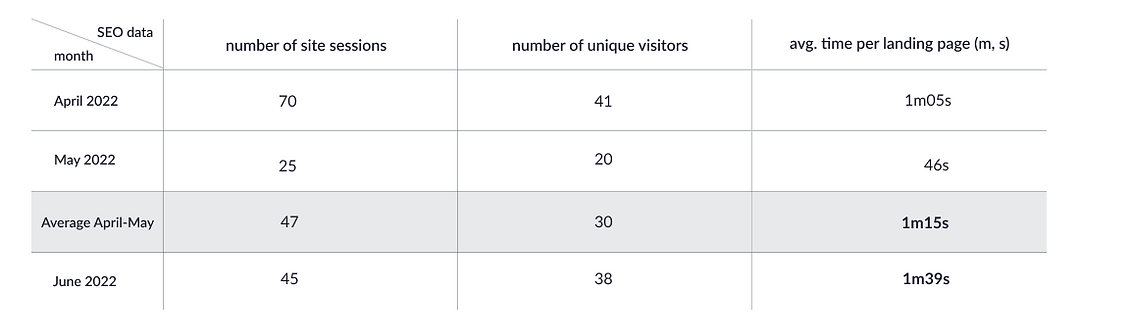
Increase in the average time per session for the landing page from an average of 1m15s to 1m39s. of 20.87%
As the purpose of redesigning my landing page was to create a better representation of myself, working on it offered a better experience for my users and increased the average time spent per landing page by 20.87%
Takeaways
There were multiple iterations throughout this process and working on my personal landing page was not easy.
A good design is not just a simple design that takes the less cognitive load for the users, but one that can inform them as clearly as possible. The most challenging part was to accommodate the information details and present them in a way that is not overwhelming to the users. The challenge was also facing my own bias and prioritizing what matters more for the users so I had to be very careful to put people first in design.